Susan Merritt completed postgraduate study in graphic design at the Basel School of Design and earned an MA in Design Research, Writing, and Criticism from the School of Visual Arts in New York. She writes about visual communication, material culture, and design history. She’s a founding member of AIGA San Diego and contributing writer to AIGA’s Eye on Design blog. Merritt and husband Calvin Woo co-founded Design Innovation Institute to foster traditional and non-traditional areas of design and sponsor student scholarships. She’s on San Diego Design Week’s advisory board and is an active member of SDDW’s steering committee.
Design Article
Design=Play=Type
What this is
Design articles offer tools and knowledge that designers can use in their practice.
When & Where
All week
Tags
Design = PlayDiscipline Craft, Graphic
Design Article
Design=Play=Type
by Susan Merritt
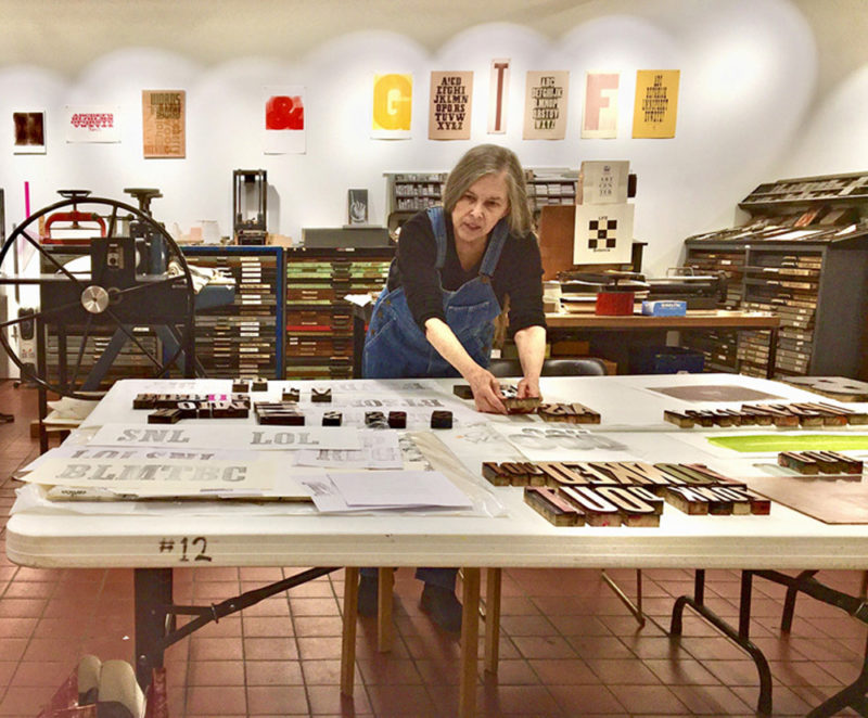
Nearly one year into the pandemic, on March 2, 2021, to be exact, Sibyl Rubottom, manager of the Athenaeum Art Center Print Studio, invited me to exhibit letterpress prints that I created during a residency at Hamilton Wood Type and Printing Museum. Hamilton, the world’s largest repository of vintage wood type, is a letterpress treasure trove and I got to spend a month there in 2003 playing with the museum’s extensive collection of wood type, decorative corners and borders, ornaments, and advertising engravings.
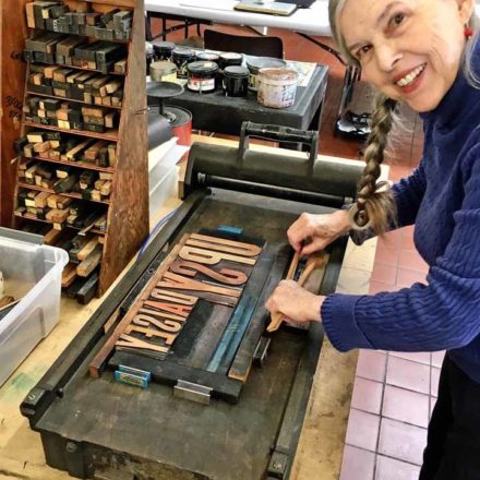
I was reluctant to do the show at first. I hadn’t been out of my house for almost a year except to take walks in the neighborhood. Although Sibyl and I were both fully vaccinated, we started planning the exhibition and curating the work remotely. Then the idea to do a residency at the Print Studio came up in our discussions. With the Art Center closed due to the pandemic, it was a perfect time to get back to the printing press; and it was inspiring to carry on wood type explorations surrounded by the design work that I did at Hamilton. I became the first typophile-in-residence at the Print Studio!
The exhibition, “Press On: Explorations in Wood Type,” presented 58 of my Hamilton letterpress prints and broadsides plus several artist’s books. The show officially ran from April 6 to June 29, 2021. In the beginning access was only available by appointment with masks required until more people were fully vaccinated. In the meantime, I shared prints and showed progress on new work through Instagram. Then on June 15 California lifted the stay-at-home order and we welcomed a flood of visitors to the Print Studio, especially from the graphic design community.
The exhibition title emerged out of an article I wrote about the Print Studio for San Diego Design Week 2020: “A Place Where Letterpress and Printmaking Press On.” The mission of the Print Studio is to ensure through classes and workshops that traditional printing practices are not forgotten. “Press on” also refers to turning on the press and my return to printing after a long hiatus.
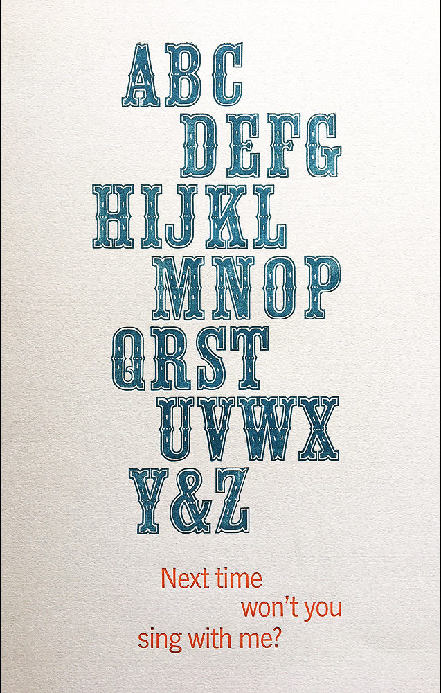
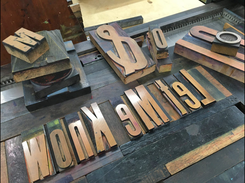
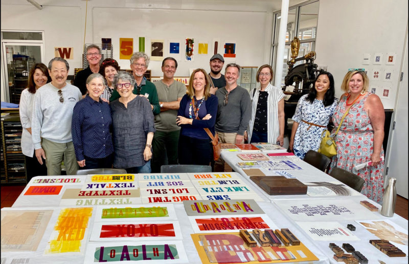
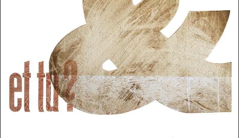
The work that I produced during my Print Studio residency will be on display at the Art Center September 2–30, 2021, and open during San Diego Design Week. This spin-off exhibition, “PS: Press On TBC,” presents what I call typographic improvisations—new work designed in response to an existing body of work. In this case, I created composites—or hybrid impressions—by overprinting onto the Hamilton prints using wood type available in the Print Studio. The large letters and numbers from Hamilton’s collection, some of which measure up to 16 inches, became backdrops for whimsical phrases and typographic treatments inspired by the shape of the characters or their vocal sounds.
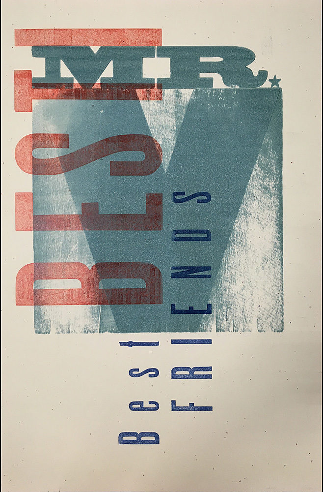
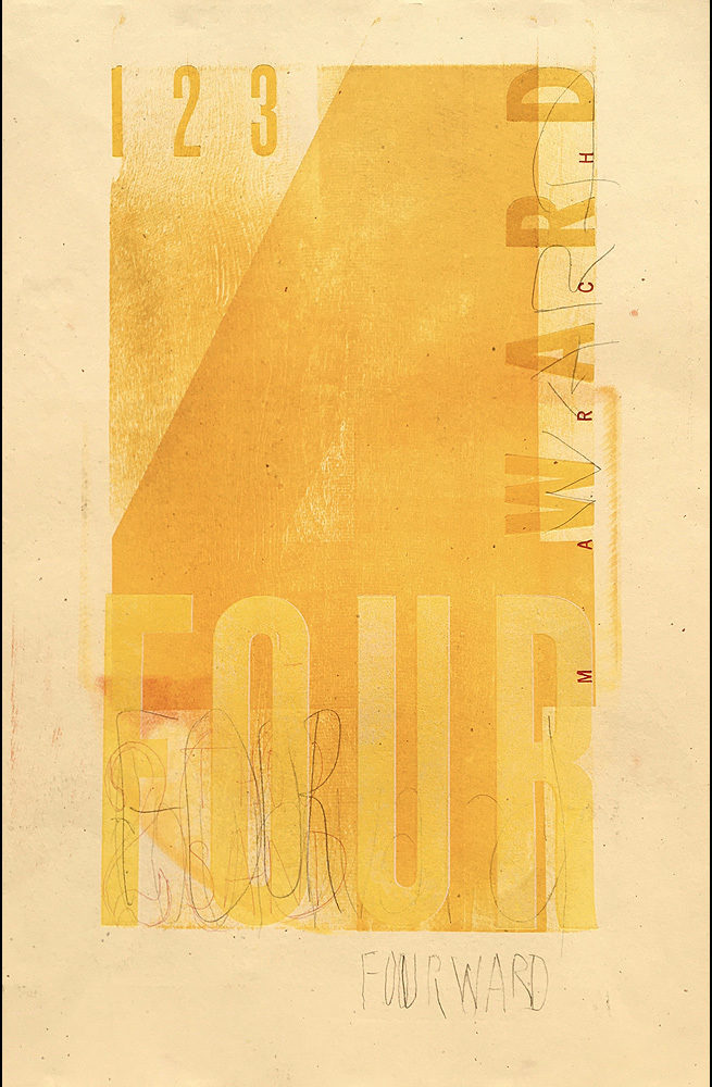
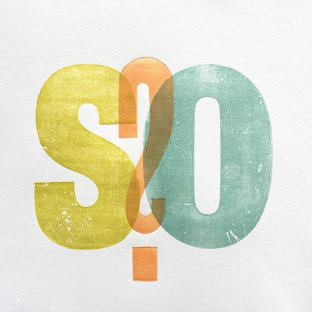
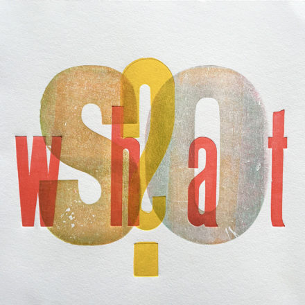
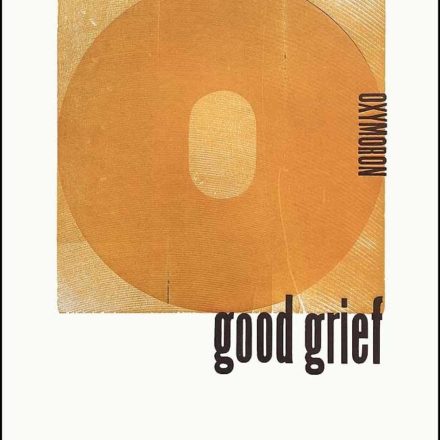
Among other recent pieces are spontaneous compositions that treat letters as abstract shapes while others strive to convey a message. For example, three-letter SMS acronyms, made popular when text messaging initially limited the number of characters, inspired a series of prints that parlay these abbreviations into playful cryptic messages for the reader to decipher. That project gave rise to the exhibition title “PS: Press On TBC.” PS standing for postscript as well as Print Studio and TBC is the SMS acronym for to be continued.
Returning to the printing press during the pandemic was extremely cathartic and playing with type in such a captivating creative space as the Print Studio was reinvigorating. It took me back to when I was a 22-year-old postgraduate student at the Basel School of Design in Switzerland where typography was a required class taught by Wolfgang Weingart in the school’s type shop, which graphic design students shared with the typesetting apprentices. That was my introduction to typography and letterpress printing and I printed my first limited edition typographic book in that type shop alongside Weingart.
That experience, together with André Gürtler’s letterform design and type history classes, opened my eyes to the expressive potential of the characters of the Roman alphabet and instilled in me an appreciation for the craft of type and a passion for the printed page. Throughout my career as a graphic designer, design educator, and book artist, typography has been at the heart of my creative work, as well as my design research and writing.
Another takeaway from Basel, especially encouraged by Kurt Hauert who taught visual translation, was the process of exploring a broad range of possibilities. I liken this open-ended method of discovery and invention to play, the joy of losing one’s self in one’s work without regard for a specific outcome. This can lead to serendipitous results and unexpected surprises.
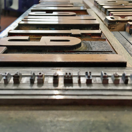
While trying different techniques during my residency at Hamilton, I experimented with printing the type back-to-front. The reverse side of wood type was left untreated and often had deep grooves from the initial sawing when logs were sliced up during production. To emphasize this materiality, I inked and printed the rough-hewn side then overprinted the smoother surface of the actual letter using transparent inks so the wood grain would be visible through the letter. I liked the concept of reuniting the raw material with the manufactured product and the results were visually interesting, so I used this technique a lot in my prints from Hamilton. It worked well because the backs of Hamilton’s wood type were very rough. It didn’t work as well with the Print Studio type because the backs were smoother and less textured. It might have had to do with the vastly different sizes between the wood type sorts or different manufacturing processes.
Designing with moveable type is like playing with building blocks or putting together a challenging puzzle. Letterpress is an incredible system of component parts that includes type, leading, and furniture, various pieces of wood and metal inserted around and between type to hold the array of pieces in place; all measured in points and picas. It’s possible, though, to break free of the rigorous mathematical structure and assemble more impromptu compositions with the help of very strong magnets that secure type elements on the bed of the printer. I also like to experiment with different ways of applying ink to the type surface and sometimes rotate or shift the paper to see what happens. No matter what the approach, it’s always a thrill to carefully peel the paper away from the inked type and see the reverse image revealed. Now, that’s fun!
“PS: Press On TBC” runs from September 2–30, 2021, at the Athenaeum Art Center located at Bread & Salt in Logan Heights. The exhibition will be open during San Diego Design Week on Thursday, September 9, and Saturday, September 11, 11:00 –5:00 and during the Barrio Art Crawl on Saturday, September 11, 5:00–8:00.